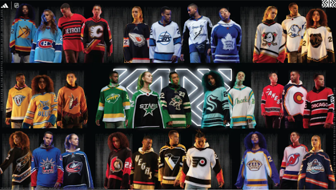
Wow, it's been three years since I last posted on this blog about the Oilers and a whole lot has happened since. I won't get into it because if you're reading this, then you already know as you follow the team.
So let's get right into it. Let's talk about the new NHL retro jerseys by Addidas that dropped. By "retro" they mean mostly the 1990s. Because when I think "retro", I think 90s, right? Ugh. Anyway, here they are, but you might want some 3D glasses for some of these. Now THAT would be retro.
We'll start at the left and go across then down...
First off, these are all terrible. And look at the models. Where are they looking? Do they know what a hockey is?
Anyway...
Panthers: When I think hockey, I think palm trees and hockey sticks, don't you? 1/10
Habs: Light blue as well? Why? What else is different? 3/10
Wings: Straight words are dull when you have one of the coolest logos in the league and don't use it. It looks like a college sweatshirt. 1/10
Flames: Now this is actually a retro they had and wasn't too shabby as it was the first time the black came out. But that angled line brings it down a notch. 6/10
Oilers: I never liked the MacFarlane logo and jersey when it came out, but with the orange, it's a little better. If the logo was replaced with the usual Oilers logo in a reverse scheme, then these would be better. 5/10
Jets: What's with the light blue? (See Panthers and Habs). I like their old logo and their "new" one, but without any red, it's dull. 4/10
Bolts: One of the worst logos back then. 3/10.
Leaves: The look on that model's face says it all. If we were to do a playoff style contest for these jerseys, then the Leaves wouldn't make it past the first round here either.
Ducks: There you go! Quack mask is back! 7/10
Sabres: That buffalo is a marshmellow. 2/10
Bruins: Awwwww. He so cute. But no. 3/10
Preds: NOW YOU'RE TALKING! That tiger predator is a mean machine logo. 8/10
Blues: You're the BLUES not the YELLOWS. 4/10
Yotes: Um. I had to zoom in to be sure. This is pukey. 2/10
Wild: Beauty throw back to the North Star colours. Couldn't stand the team then, can't stand them now--that includes all of Minnesota, but these retros are sharp. 8/10
Stars: Meh. 5/10. Is Todd Nelson still an assistant coach there?
???: I do not even know what team this is. 0/10
Kraken: A nice shout out to the ol' Metropolitans, but the logo is not retro. It's sooo 2020. 4/10
Sharks: The Seals! That's the way. 9/10.
Canes: C A N E S. Woo wee. woo. Shoulda gone black. 3/10.
Avs: Yes! Colorado Rockies means Don Cherry, right? Keep your promises. 8/10
Hawks: C H I C A G O. Avoiding the whole head thing. So many options, so little time. Like D E T R O I T, they get 1/10.
Caps: Eagle Fang! Yeah! 9/10
Rangers: Ms. Liberty was always a cool logo. 9/10
Jackets: Same ol' logo. Blah. 3/10
Sens: Isn't it their jersey now? At least it doesn't say O T T A W A. 2/10
Knights: V E G A S. Ugh. 1/10
Pens: YES! Sharp AF. Good logo throwback. 8/10
Flyers: Indeed but not as sharp as the Pens but close. 7/10. 9/10 if the Cooperalls are included.
Kings: Oh heck yeah. Thems the colours before Gretzky got there. 9/10
Devils: Orange? No no! Shoulda gone green like in Seinfeld. But still, pretty cool. 7/10
Islanders: Ahoy mateys! Fishsticks are back! The worst logo and jersey when it first came out and I didn't think they'd ever do it again, but this takes balls 10/10.
Which ones do you like and hate?


No comments:
Post a Comment